Making nice maps for posters with Python 🗺️+🐍
Contents
Making nice maps for posters with Python 🗺️+🐍
To communicate your results effectively to people 🧑🤝🧑, you may come to a point where making maps are needed.
These maps could be created for a conference poster, a presentation, or even for a social media 🐦 post!
In this tutorial 🧑🏫, we’ll focus on making basic 2D maps, and by the end of this lesson, you should be able to:
Set up basic map elements - basemap, overview map, title and axis annotations 🌐
Plot raster data (images/grids) and choose a Scientific Colour Map 🌈
Plot vector data (points/lines/polygons) with different styles 🗠
Save and export your map into a suitable format for your audience 😎
🎉 Getting started
Once you have an idea for what to map, you will need a way to draw it 🖌️.
There are plenty of ways to make maps 🗾, from pen and paper to Photoshop.
We’ll start by loading some of these tools, that help us to process and visualize our data 📊.
import icepyx as ipx # for downloading and loading ICESat-2 data
import pygmt # for making geographical maps and figures
import rioxarray # for performing geospatial operations like reprojection
import xarray as xr # for working with n-dimensional data


Just to make sure we’re on the same page, let’s check that we’ve got the same versions.
print(f"icepyx version: {ipx.__version__}")
pygmt.show_versions()
icepyx version: 0.6.2
PyGMT information:
version: v0.6.0
System information:
python: 3.9.10 | packaged by conda-forge | (main, Feb 1 2022, 21:24:11) [GCC 9.4.0]
executable: /usr/share/miniconda3/envs/hackweek/bin/python
machine: Linux-5.13.0-1021-azure-x86_64-with-glibc2.31
Dependency information:
numpy: 1.22.3
pandas: 1.4.1
xarray: 0.21.1
netCDF4: 1.5.8
packaging: 21.3
ghostscript: 9.54.0
gmt: 6.3.0
GMT library information:
binary dir: /usr/share/miniconda3/envs/hackweek/bin
cores: 2
grid layout: rows
library path: /usr/share/miniconda3/envs/hackweek/lib/libgmt.so
padding: 2
plugin dir: /usr/share/miniconda3/envs/hackweek/lib/gmt/plugins
share dir: /usr/share/miniconda3/envs/hackweek/share/gmt
version: 6.3.0
A note about layers 🍰
What do you do when you want to plot several datasets overlapping the same geographical area? 🤔
A general rule of thumb is to have the raster images on the ‘bottom’ 👎🏽, and the vector data plotted on ‘top’ 👍🏽.
Think of it like making a fancy birthday cake 🎂, starting with the dense cake flour (raster), and decorating the colourful icing on top!
0️⃣ The data
Download ATL14 Gridded Land Ice Height 🏔️
This is a 125m ATLAS/ICESat-2 L3B raster grid product over the cryosphere (ice) regions.
Specifically, this includes places like:
Antarctica (AA) 🇦🇶
Alaska (AK) 🏴
Arctic Canada North (CN) 🇨🇦
Arctic Canada South (CS) 🇨🇦
Greenland and peripheral ice caps (GL) 🇬🇱
Iceland (IS) 🇮🇸
Svalbard (SV) 🇸🇯
Russian Arctic (RA) 🇷🇺
🔖 References:
Smith, B., B. P. Jelley, S. Dickinson, T. Sutterley, T. A. Neumann, and K. Harbeck. 2021. ATLAS/ICESat-2 L3B Gridded Antarctic and Arctic Land Ice Height, Version 1. Boulder, Colorado USA. NASA National Snow and Ice Data Center Distributed Active Archive Center. doi: https://doi.org/10.5067/ATLAS/ATL14.001.
Official NSIDC download source - https://nsidc.org/data/ATL14
Source code for generating ATL14/15 - https://github.com/SmithB/ATL1415
# Set up an instance of an icepyx Query object
# for a Region of Interest located over Iceland
region_iceland = ipx.Query(
product="ATL14", # ICESat-2 Gridded Annual Ice Product
spatial_extent=[-28.0, 62.0, -10.0, 68.0], # minlon, minlat, maxlon, maxlat
)
Inside of the region_iceland class instance are attributes
that can be accessed using dot ‘.’ something.
⏩ Type out region_iceland. and press Tab to see some of them!
# Check that we've selected the right region
region_iceland.visualize_spatial_extent()
# See the version of the ATL14 product we're using
print(region_iceland.product)
print(region_iceland.product_version)
ATL14
001
🔖 For a more complete tutorial on using icepyx, see:
🧊 Load the grid data into an xarray.Dataset
An xarray.Dataset
is a data structure that puts labels on top of the dimensions.
So, for a raster grid, there would be X and Y geographical dimensions.
At each X and Y coordinate, there is a Z value. This Z value can be something like elevation or temperature.
Z-values in /z/
|
--------------------
/ 1 / 2 / 3 / 4 / 5 /
/ 2 / 4 / 2 / 7 / 0 /
/ 3 / 6 / 9 / 2 / 5 / Y-dimension
/ 4 / 5 / 1 / 8 / 1 /
/ 5 / 0 / 2 / 4 / 3 /
--------------------
X-dimension
# Login to Earthdata and download the ATL14 NetCDF file using icepyx
region_iceland.earthdata_login(
uid="uwhackweek", # EarthData username, e.g. penguin123
email="hackweekadmin@gmail.com", # e.g. penguin123@southpole.net
s3token=False, # Change to True if you signed up for preliminary access
)
region_iceland.download_granules(path="/tmp")
Total number of data order requests is 1 for 2 granules.
Data request 1 of 1 is submitting to NSIDC
order ID: 5000003039868
Initial status of your order request at NSIDC is: processing
Your order status is still processing at NSIDC. Please continue waiting... this may take a few moments.
Your order is: complete
Beginning download of zipped output...
Data request 5000003039868 of 1 order(s) is downloaded.
Download complete
## Reading ATL14 NetCDF file using icepyx
# reader = ipx.Read(
# data_source="ATL14_IS_0311_100m_001_01.nc",
# product="ATL14",
# filename_pattern="ATL{product:2}_{region:2}_{first_cycle:2}{last_cycle:2}_100m_{version:3}_{revision:2}.nc",
# )
# print(reader.vars.avail())
# reader.vars.append(var_list=["x", "y", "h", "h_sigma"])
# ds: xr.Dataset = reader.load()
# ds
# Load the NetCDF using xarray.open_dataset
# https://n5eil01u.ecs.nsidc.org/ATLAS/ATL14.001/2019.03.31/ATL14_IS_0311_100m_001_01.nc
ds: xr.Dataset = xr.open_dataset(filename_or_obj="/tmp/ATL14_IS_0311_100m_001_01.nc")
The original ATL14 NetCDF data comes in a projected coordinate system called NSIDC Sea Ice Polar Stereographic North (EPSG:3413) 🧭.
We’ll reproject it to a geographic coordinate system (EPSG:4326) first, and that will give nice looking longitude and latitude 🌐 coordinates.
ds_3413 = ds.rio.write_crs(input_crs="EPSG:3413") # set initial projection
ds_4326 = ds_3413.rio.reproject(dst_crs="EPSG:4326") # reproject to WGS84
ds_iceland = ds_4326.sel(x=slice(-28.0, -10.0), y=slice(68.0, 62.0)) # spatial subset
ds_iceland
<xarray.Dataset>
Dimensions: (x: 5980, y: 2310)
Coordinates:
* x (x) float64 -25.29 -25.29 -25.29 ... -13.17 -13.17
* y (y) float64 67.12 67.12 67.11 ... 62.44 62.44 62.44
Polar_Stereographic int64 0
Data variables:
ice_mask (y, x) float32 nan nan nan nan nan ... nan nan nan nan
cell_area (y, x) float32 nan nan nan nan nan ... nan nan nan nan
h (y, x) float32 nan nan nan nan nan ... nan nan nan nan
h_sigma (y, x) float32 nan nan nan nan nan ... nan nan nan nan
data_count (y, x) float32 nan nan nan nan nan ... nan nan nan nan
misfit_rms (y, x) float32 nan nan nan nan nan ... nan nan nan nan
misfit_scaled_rms (y, x) float32 nan nan nan nan nan ... nan nan nan nan
Attributes: (12/53)
GDAL_AREA_OR_POINT: Area
Conventions: CF-1.7
contributor_name: Benjamin Smith (besmith@uw.edu), Tyle...
contributor_role: Investigator, Investigator, Investiga...
date_type: UTC
description: This data set (ATL14) contains season...
... ...
processing_level: 3B
references: http://nsidc.org/data/icesat2/data.html
project: ICESat-2 > Ice, Cloud, and land Eleva...
instrument: ATLAS > Advanced Topographic Laser Al...
platform: ICESat-2 > Ice, Cloud, and land Eleva...
source: SpacecraftThe ‘ds_iceland’ xarray.Dataset includes many data variables (Z-values)
and attributes (metadata).
Feel free to click on the dropdown icons 🔻📄🍔 to explore what’s inside!
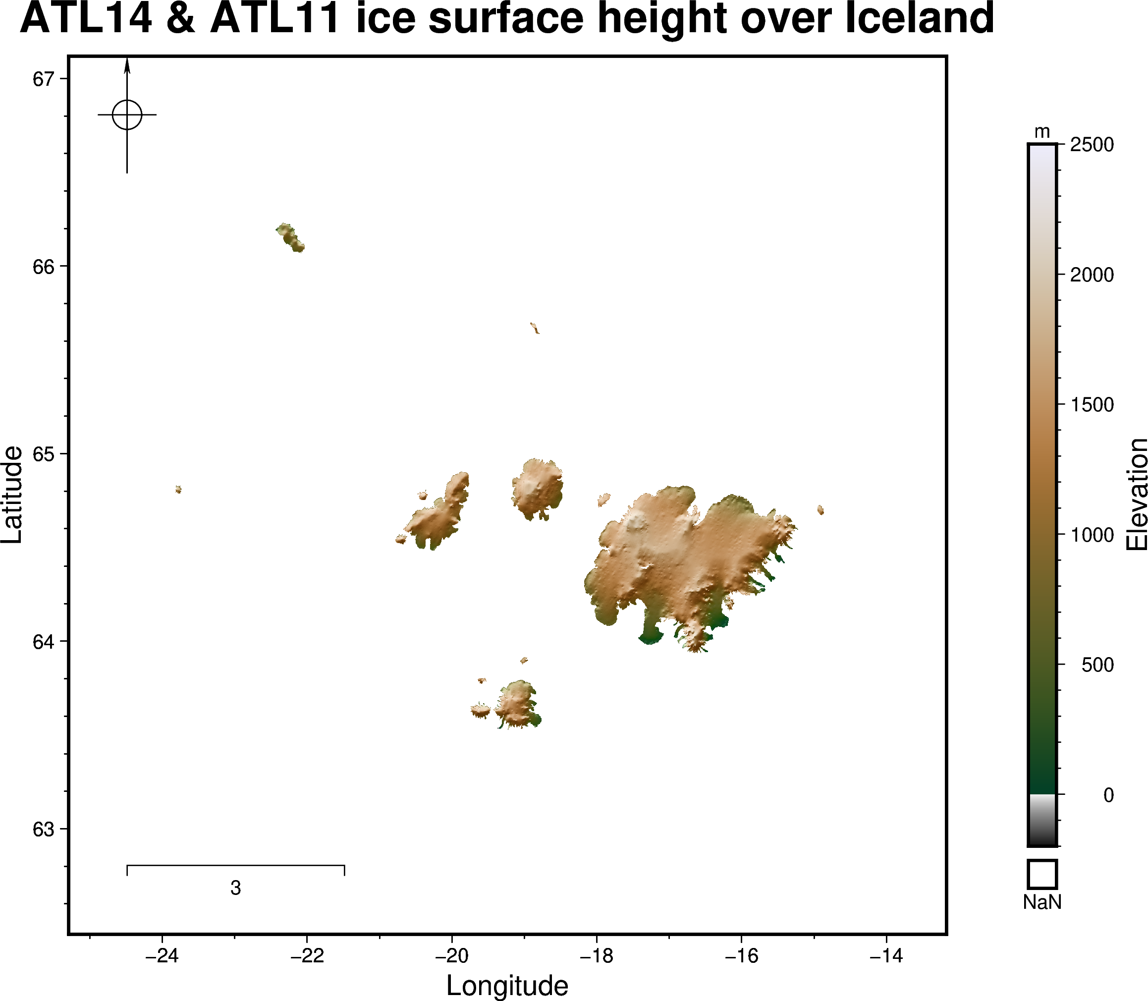
1️⃣ The raster basemap 🌈
Making the first figure! 🎬
Colours are easier to visualize than numbers. Let’s begin with just three lines of code 🤹
We’ll use PyGMT’s pygmt.Figure.grdimage to make this plot.
fig = pygmt.Figure() # start a new instance of a blank Figure canvas
fig.grdimage(grid=ds_iceland["h"], frame=True) # plot the height variable
fig.show() # display the map as a jupyter notebook cell output
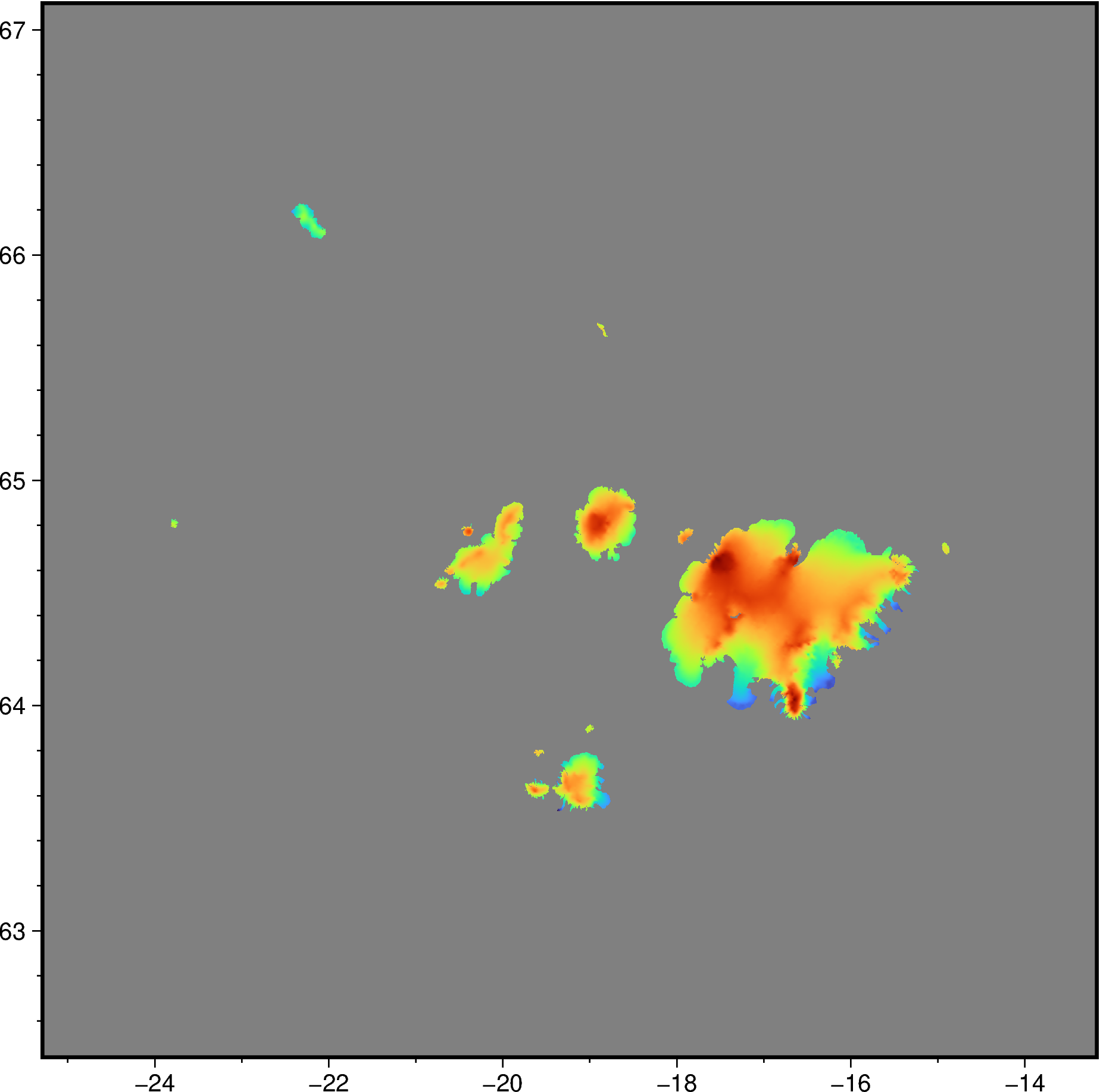
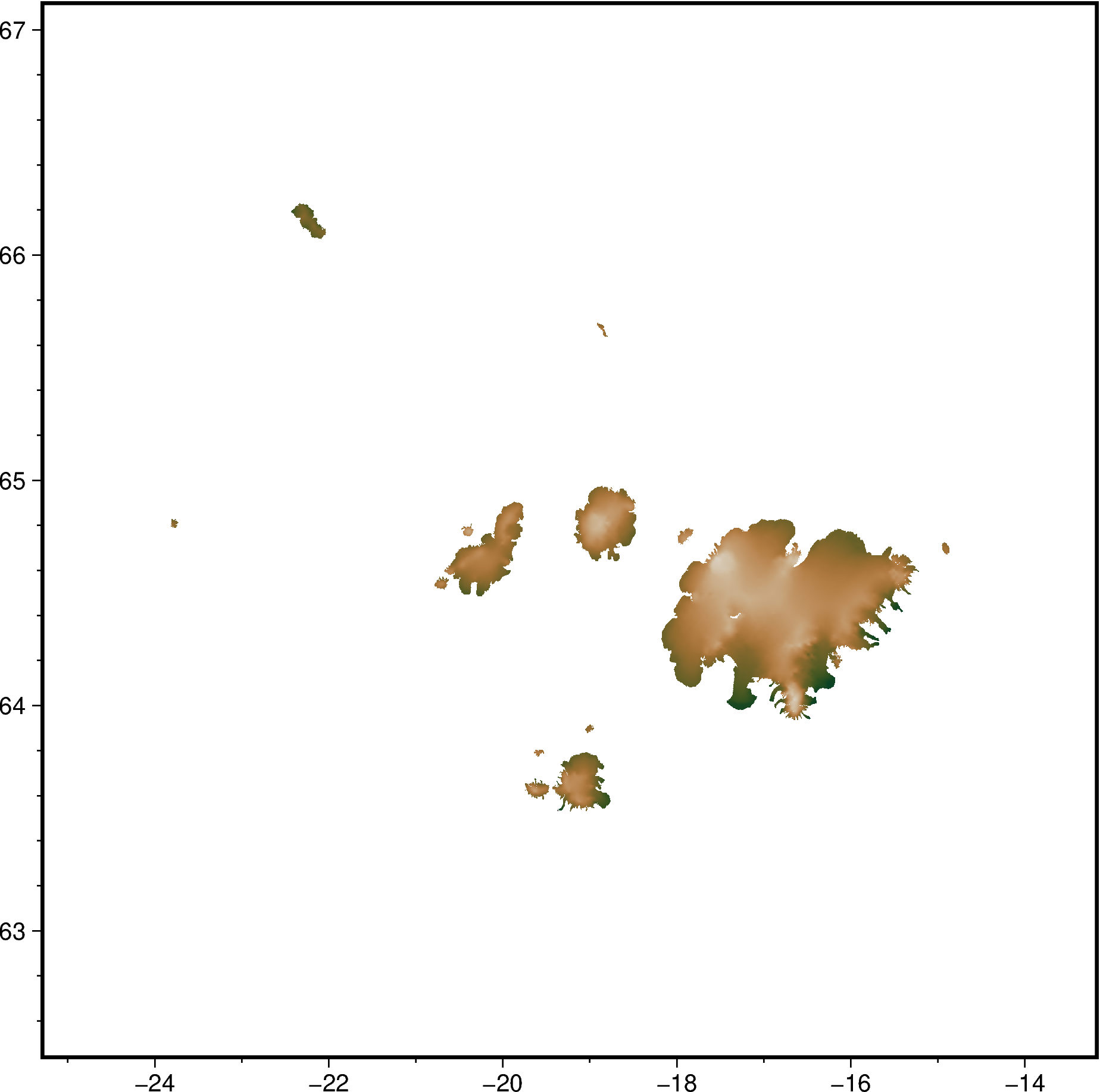
Already we’re seeing 👀 some rainbow colors and a lot of gray.
Let’s add some axis labels and a title so people know what we’re looking at 😉
Previously we used frame=True to do this automatically,
but let’s customize it a bit more!
fig.grdimage(
grid=ds_iceland["h"],
frame=[
'xaf+l"Longitude"', # x-axis, (a)nnotate, (f)ine ticks, +(l)abel
'yaf+l"Latitude"', # y-axis, (a)nnotate, (f)ine ticks, +(l)abel
'+t"ATL14 ice surface height over Iceland"', # map title
],
)
fig.show()
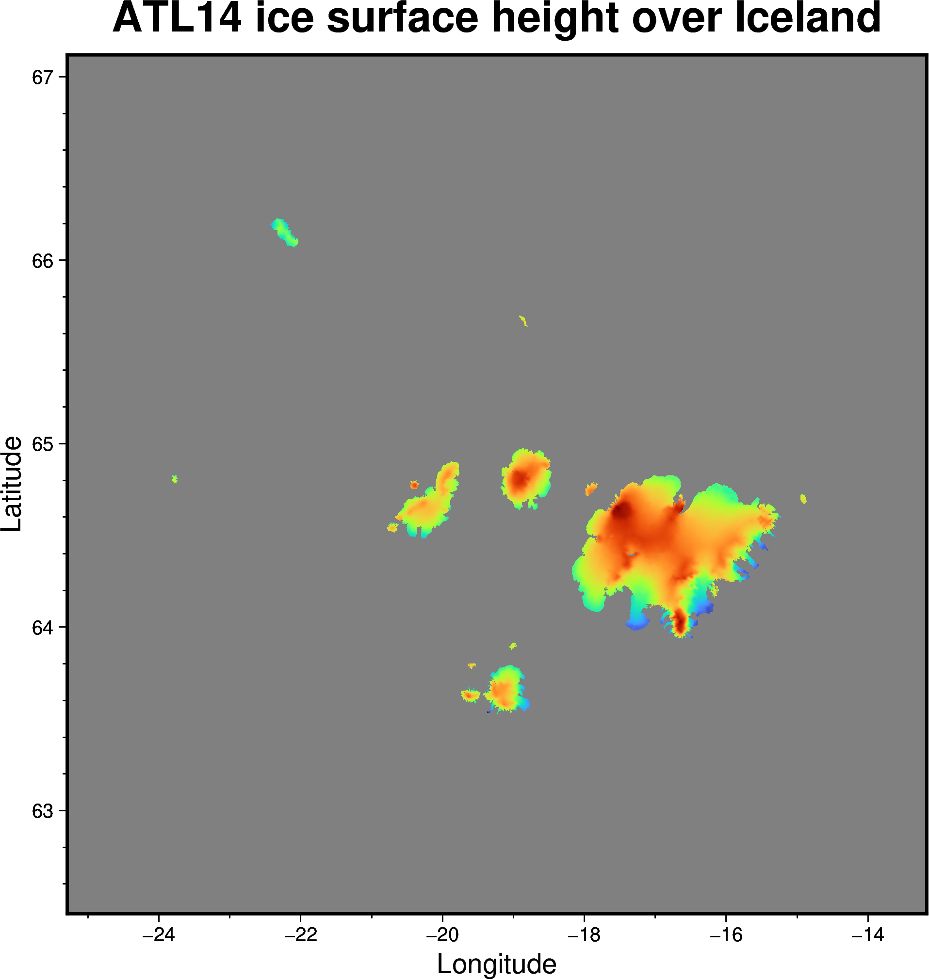
Now we’ve got some x and y axis labels, and a plot title 🥳
Still, it’s hard to know what the map colors represent, so let’s add ➕ some extra context.
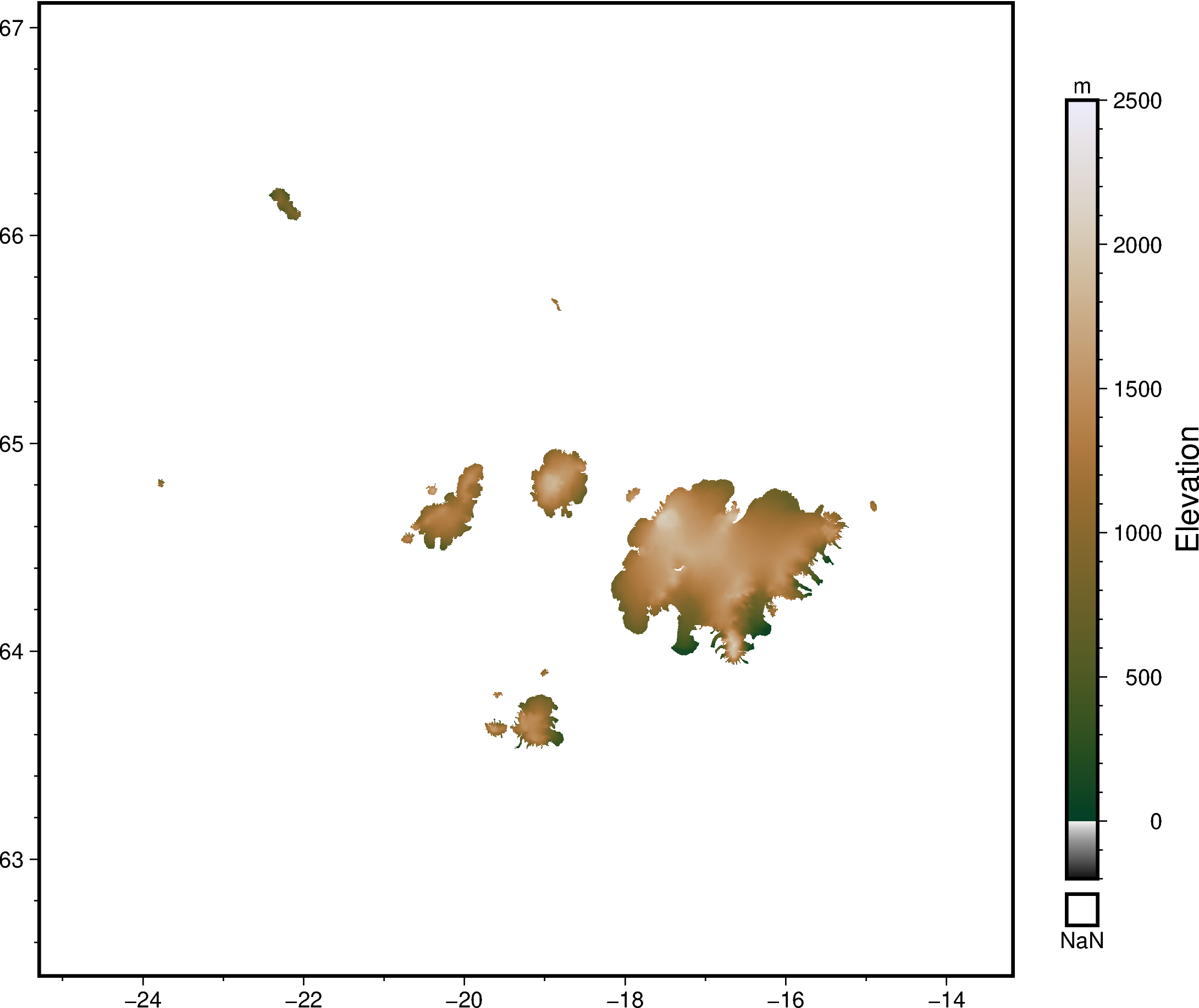
Adding a colorbar 🍫
A color scalebar helps us to link the colors on a map with some actual numbers 🔢
Let’s use
pygmt.Figure.colorbar
to add this to our existing map 🔲
fig.colorbar() # just plot the default color scalebar on the bottom
fig.show()
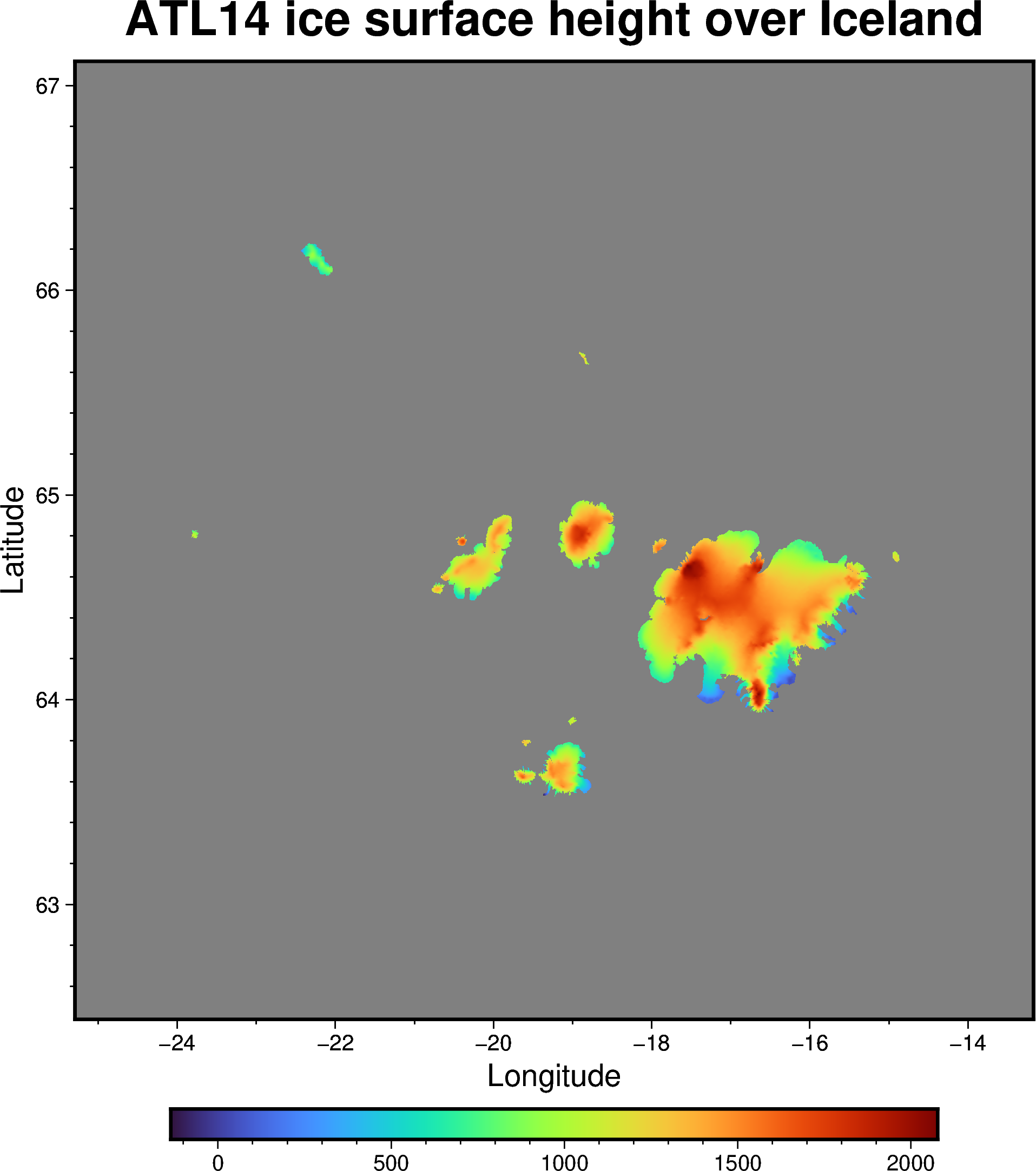
Now this isn’t too bad, but we can definitely improve it more!
Here are some ways to further customize the colorbar 📊:
Justify the colorbar position to the Middle Right ➡️
Add a box representing NaN values using +n ◾
Add labels to the colorbar frame to say that this represents Elevation in metres 🇲
🔖 References:
https://www.pygmt.org/v0.6.0/gallery/embellishments/colorbar.html
https://www.pygmt.org/v0.6.0/tutorials/advanced/earth_relief.html
fig.colorbar(position="JMR+n", frame=["x+lElevation", "y+lm"])
fig.show()
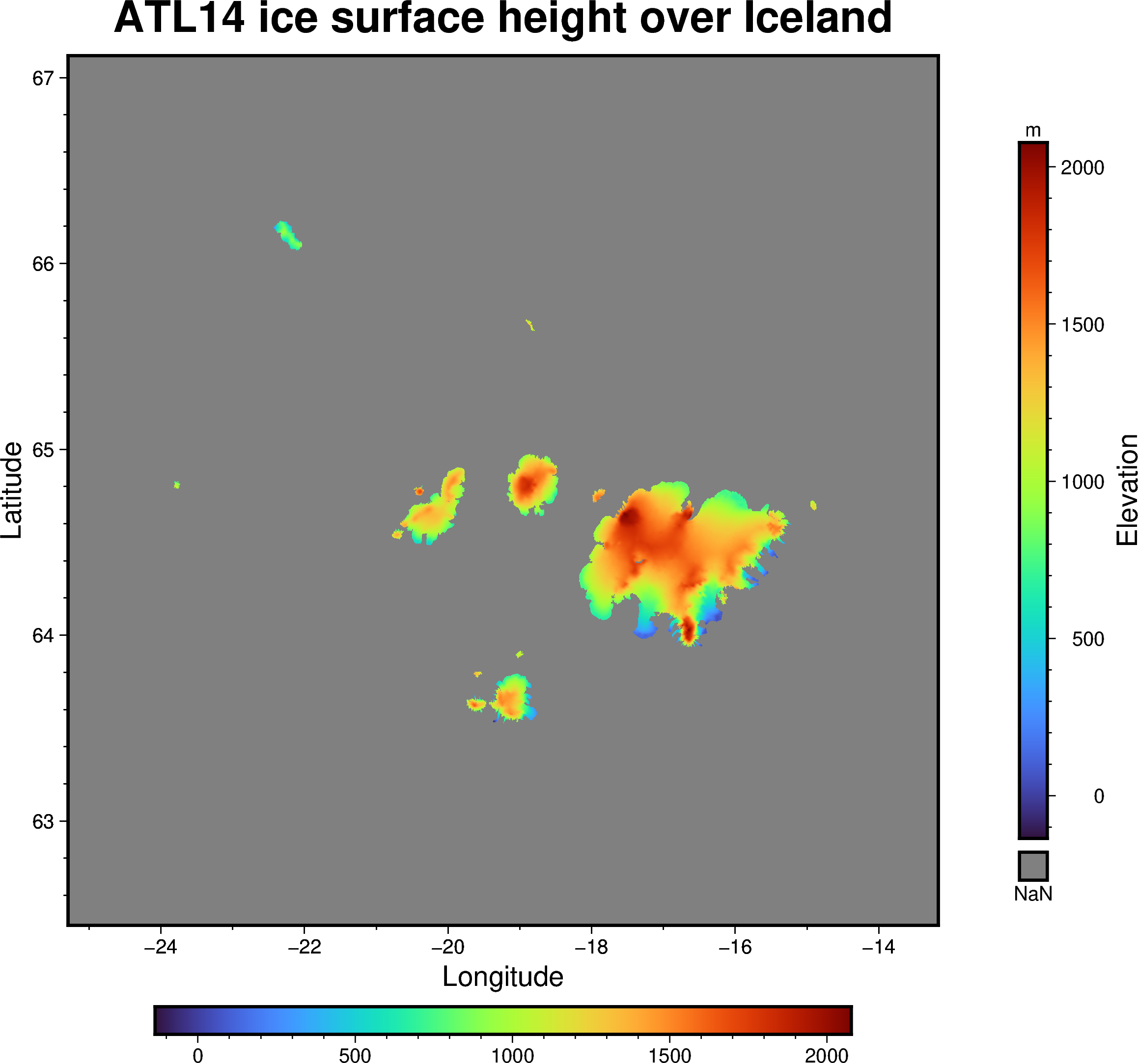
Now we’ve got a map that makes more sense 😁
Notice however, that there are two colorbars - our original horizontal 🚥 one and the new vertical 🚦 one.
Recall back to what was said about ‘layers’ 🍰.
Every time you call fig.something,
you will be ‘drawing’ on top of the existing canvas.
‼️ To start from a blank canvas 📄 again,
make a new figure by calling fig = pygmt.Figure()‼️
Choosing a different colormap 🏳️🌈
Do you have a favourite colourmap❓
When making maps, we need to be mindful 😶🌫️ of how we represent data.
Take some time ⏱️ to consider what is the most suitable type of colormap for this case.
Done? Now let’s use
pygmt.makecpt
to change our map’s color!!
🔖 References:
Crameri, F., Shephard, G.E. & Heron, P.J. The misuse of colour in science communication. Nat Commun 11, 5444 (2020). https://doi.org/10.1038/s41467-020-19160-7
List of built-in GMT color palette tables: https://docs.generic-mapping-tools.org/6.3/cookbook/cpts.html#id3
fig = pygmt.Figure() # start a new blank figure!
pygmt.makecpt(
cmap="fes", # insert your colormap's name here
series=[-200, 2500], # min an max values to stretch the colormap
)
fig.grdimage(
grid=ds_iceland["h"], # plot the xarray.Dataset's height variable
cmap=True, # setting this as True tells pygmt to use the colormap from makecpt
frame=True, # have automatic map frames
)
fig.show()
Once again, we’ll add a colorbar on the right for completeness 🎓
fig.colorbar(position="JMR+n", frame=["x+lElevation", "y+lm"])
fig.show()
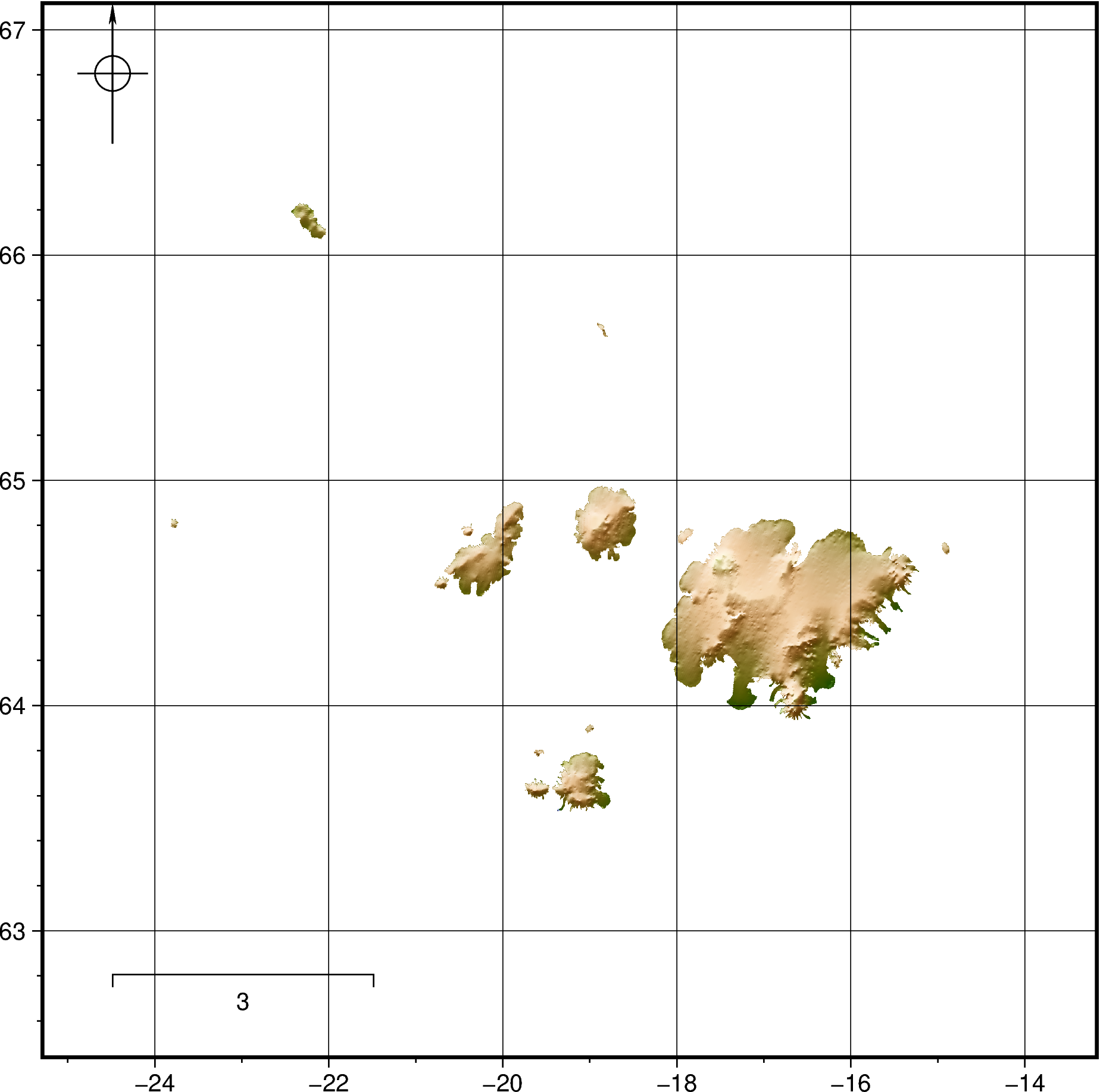
(Optional) Advanced basemap customization 😎
If you have time, try playing 🛝 with the
pygmt.Figure.basemap
method to customize your map even more.
Do so by calling fig.basemap(), which has options to do things like:
Adding graticules/gridlines using
frame="g"🌐Adding a North arrow (compass rose) using
rose="jTL+w2c"🔝Adding a kilometer scalebar using something like
map_scale="jBL+w3k+o1"📏
🔖 References:
# Code block to play with
fig = pygmt.Figure() # start a new figure
# Plot grid as a background
fig.grdimage(
grid=ds_iceland["h"],
cmap="oleron",
shading=True, # hillshading to make it look fancy
)
# Customize your basemap here!!
fig.basemap(
frame="afg",
rose="jTL+w2c",
map_scale="jBL+w3k+o1"
# Add more options here!!
)
fig.show() # show the map
2️⃣ The vector features 🚏
Coastlines for context ⛱️
Vectors include points, lines and polygons 🪢.
To keep things clean 🫧, let’s start a new map with just Iceland’s coastline.
We’ll use
pygmt.Figure.coast
to 🖌️ plot this.
🔖 References:
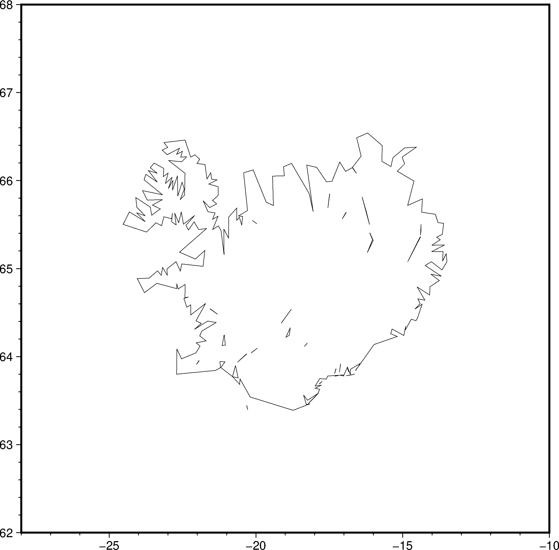
# Plain basemap with just Iceland's coastline
fig = pygmt.Figure()
fig.basemap(
region=[-28, -10, 62, 68], # PyGMT uses minlon, maxlon, minlat, maxlat
frame=True,
)
fig.coast(shorelines=True, resolution="l") # Plot low resolution shoreline
fig.show()
Overlay ICESat-2 ATL11 point track 🐧
Let’s plot some 🇽, 🇾, 🇿 data!
First, we’ll get one ATL11 Annual Land Ice Height track that crosses Iceland 🇮🇸
Easiest way to find the right track number is using 🛰️ OpenAltimetry’s web interface.

Use icepyx to download the ATL11 hdf5 file, or get a sample from this
NSIDC link
## Download ICESat-2 ATL11 Annual Land Ice Height using icepyx
region_iceland = ipx.Query(
product="ATL11",
spatial_extent=[-28.0, 62.0, -10.0, 68.0], # minlon, minlat, maxlon, maxlat
tracks=["1358"], # Get one specific track only
)
region_iceland.earthdata_login(
uid="uwhackweek", email="hackweekadmin@gmail.com" # assumes .netrc is present
)
region_iceland.download_granules(path="/tmp")
Total number of data order requests is 1 for 1 granules.
Data request 1 of 1 is submitting to NSIDC
order ID: 5000003039876
Initial status of your order request at NSIDC is: processing
Your order status is still processing at NSIDC. Please continue waiting... this may take a few moments.
Your order is: complete
Beginning download of zipped output...
Data request 5000003039876 of 1 order(s) is downloaded.
Download complete
Once downloaded 💾, we can load the ATL11 hdf5 file into an
xarray.Dataset.
The key 🔑 data variables we’ll use later are ‘longitude’, ‘latitude’ and ‘h_corr’ (mean corrected height).
dataset: xr.Dataset = xr.open_dataset(
filename_or_obj="/tmp/processed_ATL11_135803_0313_005_01.h5",
group="pt2", # take the middle pair track out of pt1, pt2 & pt3
)
dataset
<xarray.Dataset>
Dimensions: (cycle_number: 11, ref_pt: 3492)
Coordinates:
* cycle_number (cycle_number) float32 3.0 4.0 5.0 ... 12.0 13.0
delta_time (ref_pt, cycle_number) datetime64[ns] NaT ... 20...
latitude (ref_pt) float64 63.38 63.38 63.38 ... 65.58 65.58
longitude (ref_pt) float64 -19.68 -19.68 ... -20.23 -20.23
* ref_pt (ref_pt) float64 3.524e+05 3.524e+05 ... 3.647e+05
Data variables:
h_corr (ref_pt, cycle_number) float32 nan nan ... 228.1
h_corr_sigma (ref_pt, cycle_number) float32 nan nan ... 0.2998
h_corr_sigma_systematic (ref_pt, cycle_number) float32 nan nan ... 0.1588
quality_summary (ref_pt, cycle_number) float32 1.0 1.0 ... 1.0 0.0
Attributes: (12/22)
pair_yatc_ctr_tol: 1000
beam_spacing: 90
ReferenceGroundTrack: 1358.0
t_scale: 31557600.0
last_cycle: 13
first_cycle: 3
... ...
L_search_XT: 65
max_fit_iterations: 20
seg_atc_spacing: 100
seg_number_skip: 3.0
N_search: 3.0
xy_scale: 100.0Great, we’ve got some ATL11 point data 🎊!!
Let’s add ➕ this to our basemap.
Plotting 2D vector data 🪡 happens via
pygmt.Figure.plot.
🔖 References:
# Plot the ATL11 pt2 track in lightgreen color
fig.plot(x=dataset.longitude, y=dataset.latitude, color="lightgreen")
fig.show()
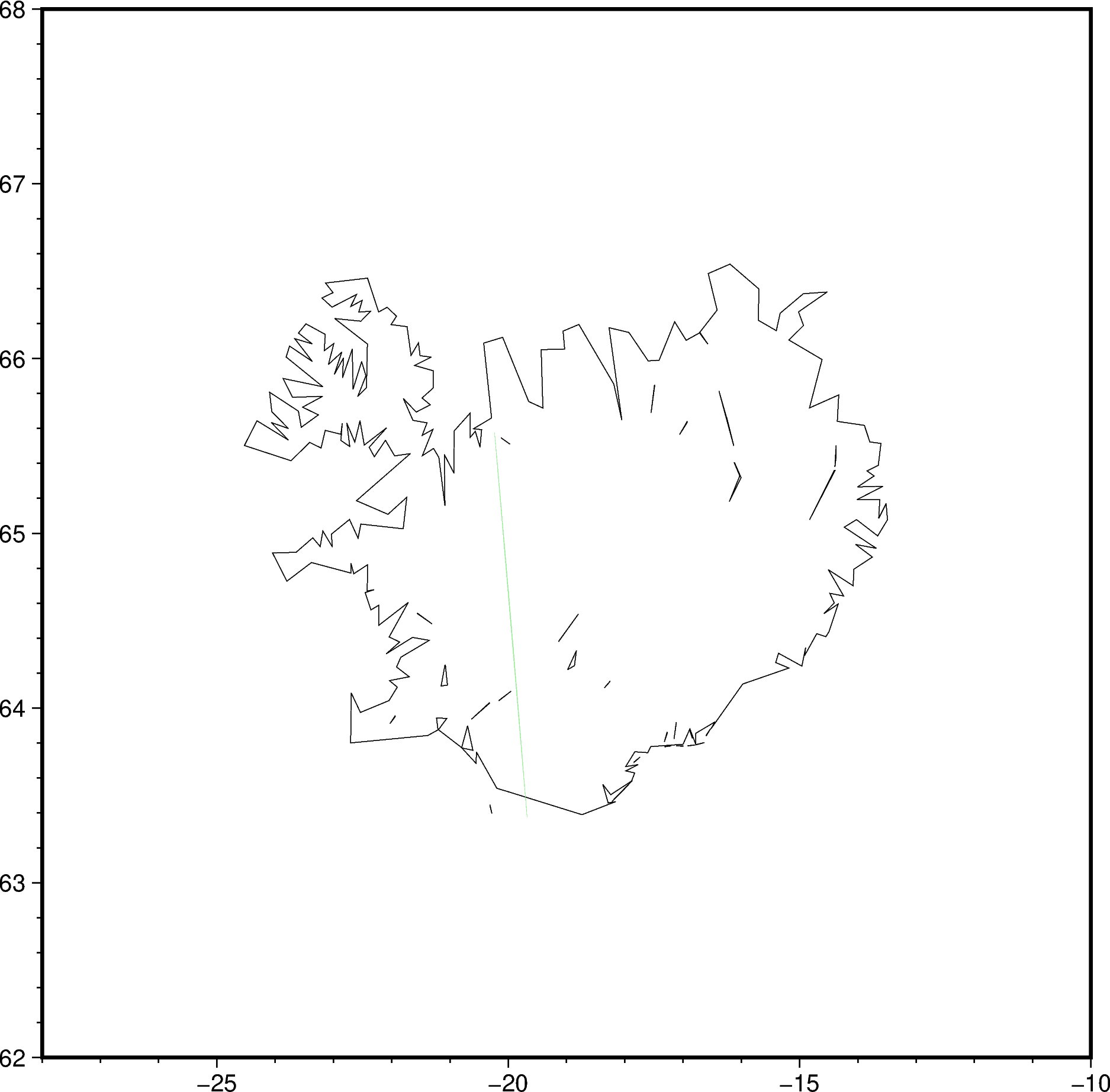
Maybe not totally obvious 🥸 since the green points are quite faint.
Let’s modify the plot
command to make it stand out more:
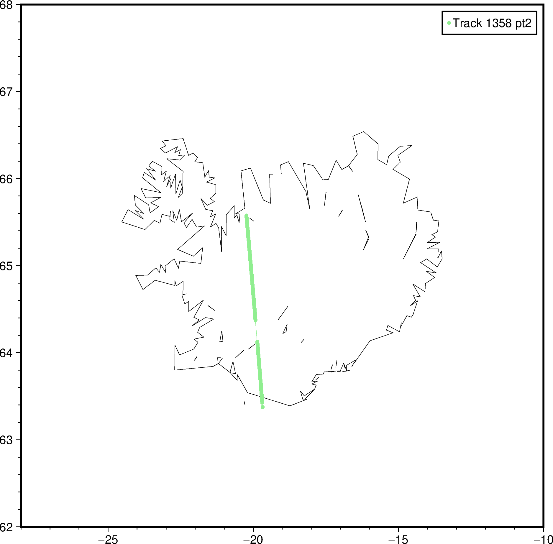
Use the ‘style’ parameter to plot bigger 🟢 circles
Use the ‘label’ parameter to add this track to the legend entry
Oh yes, 🍀 there’s a way to automatically add a legend using
pygmt.Figure.legend!
🔖 References:
fig.plot(
x=dataset.longitude,
y=dataset.latitude,
color="lightgreen",
style="c0.1c", # circle of size 0.1 cm
label="Track 1358 pt2", # Label this ICESat-2 track in the legend
)
fig.legend() # With no arguments, the legend will be on the top-right corner
fig.show()
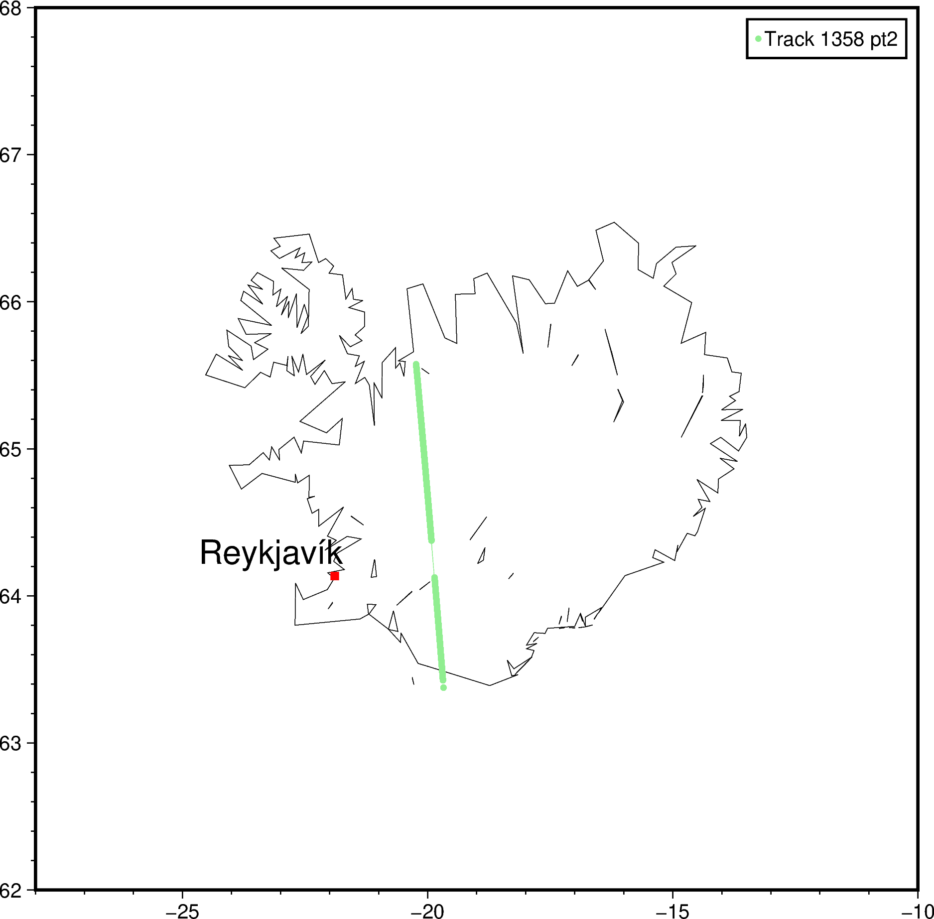
Text annotations 💬
Quite often, you’ll just want to write some 🔤 words directly on a map.
For example, you might want to ✍️ label a placename, or an A-B transect.
Let’s see how to do this using
pygmt.Figure.text ☺️.
🔖 References:
# Start off with labelling the capital Reykjavík
fig.text(x=-23.2, y=64.3, text="Reykjavík", font="16p")
# Add a red square of size 0.2 cm at the capital
fig.plot(x=-21.89541, y=64.13548, style="s0.2c", color="red")
fig.show()
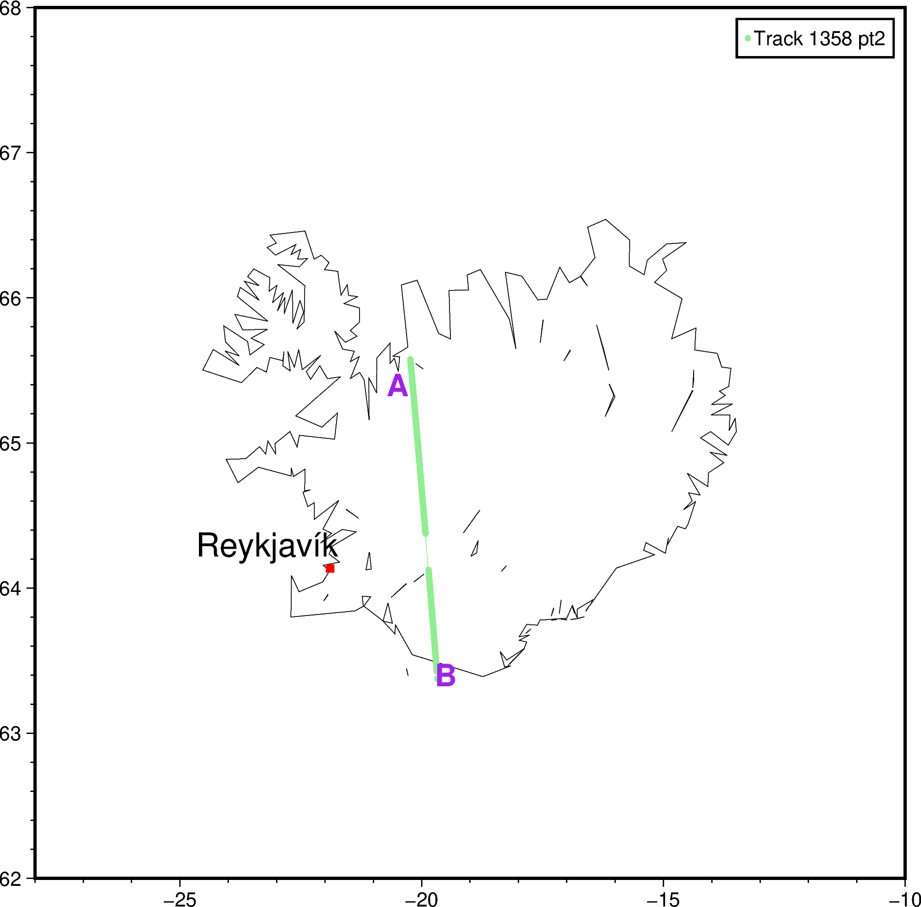
Afterwards, maybe you want to label the 🏁 start and end 🔚 points of the ICESat-2 ATL11 track as A and B.
Let’s do that, and we’ll see how to customize the font further 🤗
Use a comma-separated string of 3️⃣ components:
fig.text(x=-20.5, y=65.4, text="A", font="15p,Helvetica-Bold,purple")
fig.text(x=-19.5, y=63.4, text="B", font="15p,Helvetica-Bold,purple")
fig.show()
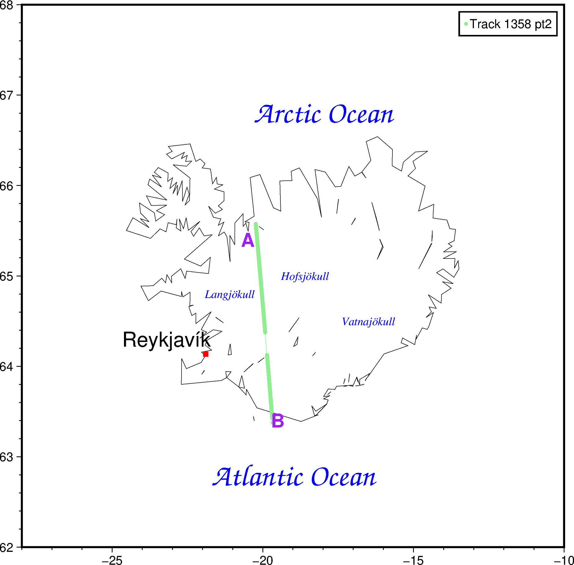
Finally, if you’re really obsessed with placenames 🏣, you can provide a Python list too!
Just note that each item in a single fig.text call
will have the same font 😉.
# Label the oceans
fig.text(
x=[-19, -18], # longitude1, longitude2, etc
y=[62.8, 66.8], # latitude1, latitude2, etc
text=["Atlantic Ocean", "Arctic Ocean"],
font="24p,ZapfChancery-MediumItalic,blue",
)
# Label top 3 largest ice caps/glaciers
fig.text(
x=[-16.5, -21.1, -18.6],
y=[64.5, 64.8, 65.0],
text=["Vatnajökull", "Langjökull", "Hofsjökull"],
font="9p,Times-Italic,blue",
)
fig.show()
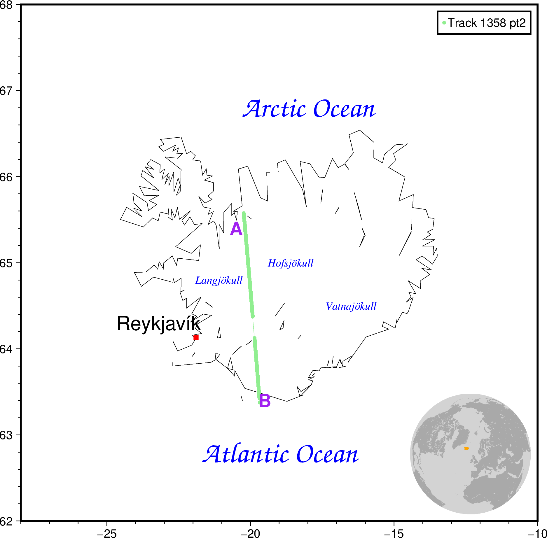
(Optional) adding an overview map 📍
For context, people might want to know where your 🔻 study region is.
Adding an 🌐 overview map as an inset can help with that.
Let’s quickly ⚡ see how to do it using
pygmt.Figure.inset
and pygmt.Figure.coast.
🔖 References:
# Start an inset cut-out at the Bottom Right corner
# with a width of 3.5 cm, offset by 0.2 cm from the map edge
with fig.inset(position="jBR+w3.5c+o0.2c"):
# All plotting here in the with-context manager will
# be in the inset cut-out. This example uses the
# azimuthal orthogonal projection centered at 10W, 60N.
fig.coast(
region="g",
projection="G-10/60/?",
land="darkgray", # land color as darkgray
water="lightgray", # water color as lightgray
dcw="IS+gorange", # highlight Iceland in orange color
)
fig.show()
3️⃣ Saving the map 💾
Now put it all together, like mixing the dry and wet ingredients of a cake 🍰
We’ll start with the raster basemap 🌈, and then plot the vector features 🚏 on top.
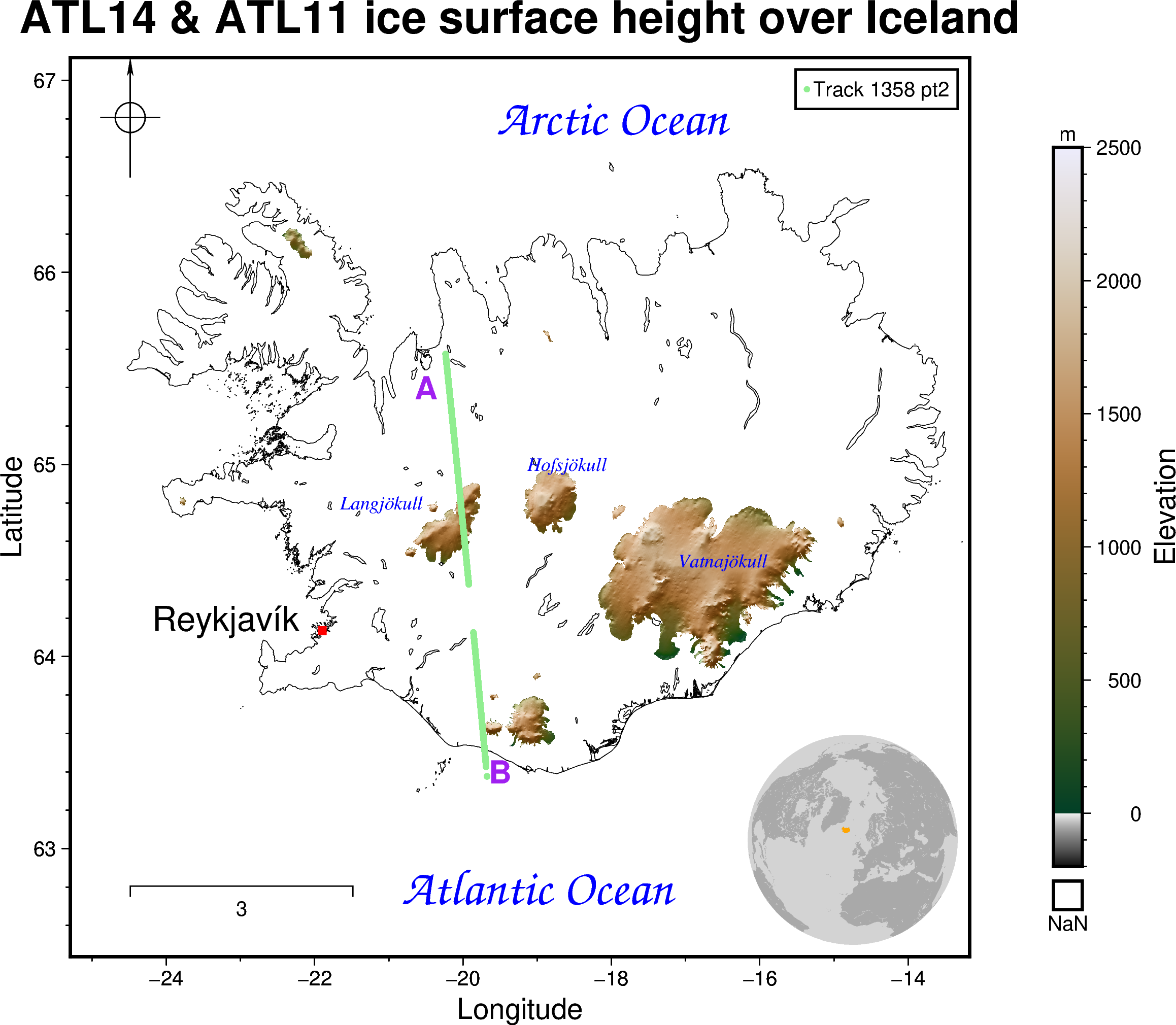
fig = pygmt.Figure() # Create blank new figure
### 1. Raster layers
## 1.1 - Plot the ICESat-2 ATL14 height grid
pygmt.makecpt(
cmap="fes", # insert your colormap's name here
series=[-200, 2500], # min an max values to stretch the colormap
)
fig.grdimage(
grid=ds_iceland["h"],
frame=[
'xaf+l"Longitude"', # x-axis, (a)nnotate, (f)ine ticks, +(l)abel
'yaf+l"Latitude"', # y-axis, (a)nnotate, (f)ine ticks, +(l)abel
'+t"ATL14 & ATL11 ice surface height over Iceland"', # map title
],
cmap=True, # use colormap from makecpt
shading=True, # add hillshading
)
### 1.2 - Add a colorbar
fig.colorbar(position="JMR+n", frame=["x+lElevation", "y+lm"])
## 1.4 - Advanced basemap customization (gridlines, north arrow, scalebar)
fig.basemap(
frame="af",
rose="jTL+w2c",
map_scale="jBL+w3k+o1"
# Add more options here!!
)
fig.show()
### 2. Vector layers
## 2.1 Coastline
fig.coast(shorelines=True, resolution="h") # Plot high resolution shoreline
## 2.2 Plot ICESat-2 ATL11 point track
fig.plot(
x=dataset.longitude,
y=dataset.latitude,
color="lightgreen",
style="c0.1c", # circle of size 0.1 cm
label="Track 1358 pt2", # Label this ICESat-2 track in the legend
)
fig.legend() # Default legend position is on the top-right corner
## 2.3 Text annotations
# Start off with labelling the capital Reykjavík!
fig.text(x=-23.2, y=64.2, text="Reykjavík", font="16p")
# Add a red square of size 0.2 cm at the capital
fig.plot(x=-21.89541, y=64.13548, style="s0.2c", color="red")
# A-B transect labels
fig.text(x=-20.5, y=65.4, text="A", font="15p,Helvetica-Bold,purple")
fig.text(x=-19.5, y=63.4, text="B", font="15p,Helvetica-Bold,purple")
# Label the oceans
fig.text(
x=[-19, -18],
y=[62.8, 66.8],
text=["Atlantic Ocean", "Arctic Ocean"],
font="24p,ZapfChancery-MediumItalic,blue",
)
# Label top 3 largest ice caps/glaciers
fig.text(
x=[-16.5, -21.1, -18.6],
y=[64.5, 64.8, 65.0],
text=["Vatnajökull", "Langjökull", "Hofsjökull"],
font="9p,Times-Italic,blue",
)
## 2.4 Overview map
with fig.inset(position="jBR+w3.5c+o0.2c"):
# All plotting here in the with-context manager will
# be in the inset cut-out. This example uses the
# azimuthal orthogonal projection centered at 10W, 60N.
fig.coast(
region="g",
projection="G-10/60/?",
land="darkgray", # land color as darkgray
water="lightgray", # water color as lightgray
dcw="IS+gorange", # highlight Iceland in orange color
)
fig.show()
To save ⬇️ the figure, use
pygmt.Figure.savefig.
The format 💽 you save it in will depend on where you want to display it.
As a general guide:
Social media 🐦 or Presentations 🧑🏫
PNG or JPG (raster formats)
Use about 150dpi or 300dpi
Posters 🪧 or Publications 📜
PDF or EPS (vector formats)
Use about 300dpi or 600dpi
fig.savefig(fname="iceland_map.png", dpi=300)
fig.savefig(fname="iceland_map.pdf", dpi=600)
That’s all 🎉! For more information on how to customize your map 🗺️, check out:
Tutorials at https://www.pygmt.org/v0.6.0/tutorials/index.html
Gallery examples at https://www.pygmt.org/v0.6.0/gallery/index.html
If you have any questions 🙋, feel free to visit the PyGMT forum at https://forum.generic-mapping-tools.org/c/questions/pygmt-q-a/11.
Submit any ✨ feature requests/bug reports to the GitHub repo at https://github.com/GenericMappingTools/pygmt
Cheers!